
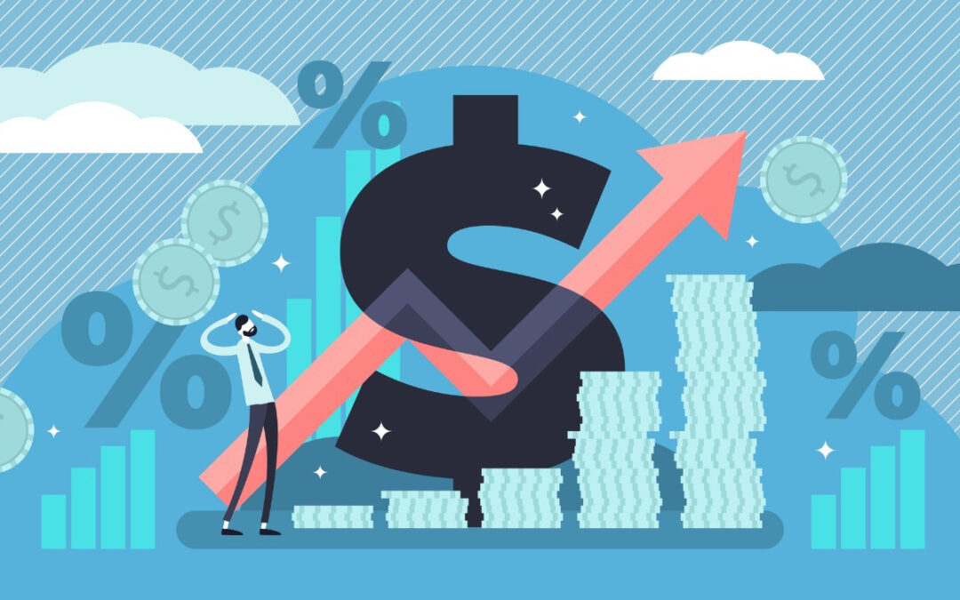
One piece of data does not make a trend. Last week, inflation data came in hotter than expected at 4.2% over the past year. This caused some speculation about the causes and the long-term impact. Many of the talking heads pointed to the high price of gas or higher groceries bills. But the short answer is higher than average inflation was expected for April, which will likely carry into May and June.
We normally see inflation data via annual price changes. This introduces the first issue which we will refer to as the “base effect.” You may recall the U.S. (and global) economy was effectively shut down from late-March 2020 onward. This immediately reduced the demand for goods and services. Going back to economics 101, lower demand will cause lower prices. So, the beginning of the story starts one year ago with superficially reduce prices, which becomes the base for prices one year later, or April 2021.
Surging demand for goods and services due to reopening has had the opposite effect on prices. Higher demand will create higher prices, and here’s the kicker, the surge just so happened to come one year after the superficial price reduction mentioned above. So, the higher measured inflation is not normalized or smoothed for the lower base and the higher demand that came one year later.
Second, the reopening has created supply chain bottlenecks. Turns out reopening is harder than closing, therefore reopening factories, manufacturing, restaurants, re-commencing flights, reinstituting shipping and trucking, etc. requires hiring, ordering raw goods, opening facilities (with COVID protocols), adjusting for distancing, etc. Hence, increasing supply of goods and services can’t instantaneous match immediate increased demand causing higher prices. Although it escaped the talking heads, its easy to see these effects are transitory, time heals all wounds including the supply/demand mismatch.
Of particular note are different types of inflation measures. Inflation of all goods and services is known as “headline” inflation (see yellow line), however investment professionals recognize the inherent volatility of two aspects, energy and food. Professionals strip out these two aspects to gain a better view of price movement. We call this “core” inflation (see green line). Notice in the accompanying chart the yellow line is more volatility than the green line. So, talking heads mentioning gas and food prices without recognizing transitory effects are painting a dubious picture.
We tend to agree with the Federal Reserve (the Fed). After recent inflation data, the Fed policymakers reiterated their belief that they don’t see any short-term need to depart from accommodative monetary policy. One member of the Fed’s governing board said he’ll need to see several more months of data on jobs and inflation before determining when to begin raising rates. Hence, the monetary backdrop is stable. Enjoy your weekend as the Summer temperatures have finally arrived!
CRN-3603403-052421
Recent Comments